114 - Phantasmagorias Part 2
Looking back at this Phantasmagorias work I have mixed feelings.
On the one hand, I'm still just as excited as I ever was about the silhouette figures themselves (already hatching plans for new ways to use them in my current work).

On the other hand, I don't think the final pieces of that time quite worked, and I believe the interactive element was a distraction. There were two different forces going on in each piece. And despite my literal use of magnets (in the black and mauve piece) the two forces pushed apart, not together. Some of the figures end-up upside down, and it doesn't help the reading of the work. There isn't any relevance in the upside down abstract shapes in this context.
I think for an interactive piece there needs to be more reason, or motivation for a person to interact. For example, opportunity to create something themselves. If the parts were more abstract it would allow more scope for creativity by the interactor. Or if the piece was more sensational (for example this Anthony McCall's work where it's very enjoyable to interact with the light) it would be more motivating to interact with it.
The idea behind the interactivity wasn't really about being interactive, it was more about being free of the constraints of composition. They were 'free composition' pieces. That makes more sense but I didn't articulate that clearly in my mind at the time.
Reviewing the support work to these - the drawings and photocopies - I prefer them, and I think they have more energy than the cutouts. The cutout shapes created using digital graphic software are too neat and tidy. It deadens them a little. They are very crisp and easy to see though.

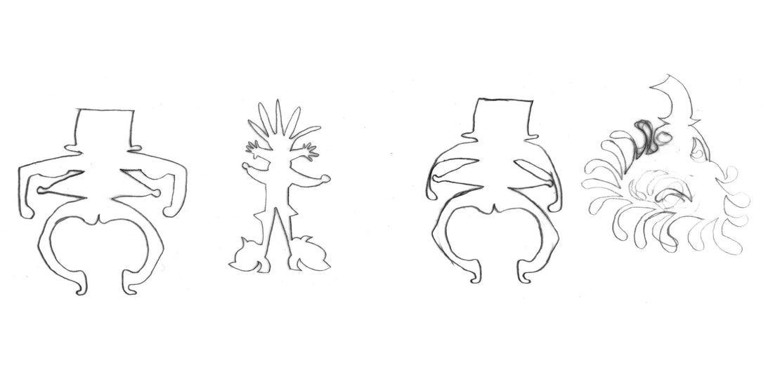
I notice that the shapes are too disparate, with no visual device to link them or make sense of the difference. There's a figure with an umbrella for a head, next to a blob with something that might be arms: if you're seeing the work for the first time, that's hard to read. Being hard to read isn't what I wanted in the work. I like a sense of mystery and space to interpret, but just looking at something and feeling muddled wasn't my aim.
Finally, looking back to a time when we were only just starting to sort out recycling bins I would not have chosen nylon and plastic materials to work with, unless they were recycled.
I do like the energy and movement in the pink and mauve piece. It does have the fairground / carnival vibe I was aiming for.
Silhouette Drawings

I used photocopies a lot to create interesting distortions (digital wasn't really an option as the computers didn't have enough memory and kept crashing and hanging).

I haven't put the sketches in chronological order, but you may be able to spot a development, which was the equal weight of the negative and the positive space. Where the spikes meet the body (above), a new line is formed indicating form in the round shape and creating the feeling of a body.


Digital Format Silhouettes


After making sourdough bread yesterday, this figure has to be named Miss Sourdough.


