222 - Primark Rejects
Setting up blinders to limit the peripheral options, pulled this project together. Here are some of the options I tried and rejected:
Looking into the shop front door. Too dark in the background, distracting lights, big empty gray patch.

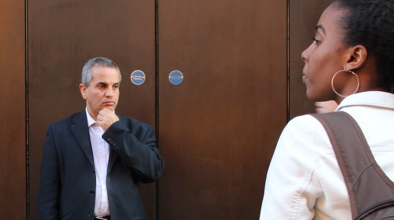
Brassy door as background. I liked this option, especially as the browns were a warm graduated shade. But the busy shop window display background was more exciting, and it had the benefit of the big windowsill benches. So although I liked this photo I excluded it from the final edit.

Another one with the store interior as a background. Just too dark and boring. I don't like that blue street sign on the right outside either.

Facing oncoming pedestrian traffic - I was obviously missing out on the main drama of the seated people.

Too much clutter in the foreground. And the shop name is too dominant.

Another side angle: any pedestrian blocked out most of the picture.

Again, the side angle just misses out on the main theatre.

There was an altercation around the dog man. Possibly someone trod on his tail?


